According to one recent study, a massive 65% of brands currently use Infographics in their content marketing efforts to some degree. The format itself has become incredibly popular over the years, and with good reason: it’s a visually attractive, compelling and engaging way to take even complicated ideas and present them in a fun way that nearly anybody can understand.
Infographics are also very popular on social media sites like Facebook and Twitter, where they’re far more likely to be shared and “favorited” than other types of content. But at the same time, it’s critical to understand that the format alone isn’t enough to resonate with your target audience. It is absolutely possible to spend a lot of time and effort, only to wind up with a “bad” Infographic that people ignore because you forgot to play into a few of the basic principles that make them such a fun type of content to begin with.
The Key to Creating Better Infographics: Breaking Things Down
One of the most important steps you can take to effectively use Infographics to boost your social media presence actually takes place before the content creation process begins in earnest.
Soon after you get that core kernel of an idea for your Infographic, you need to develop that further into a theme that will act as the spine of what you’re about to build. Remember that while Infographics are visual in nature, they still present a lot of information to the reader in a relatively short amount of time. Especially if you’re designing a piece of collateral that is stats-heavy in nature, it will be easy for someone to feel overwhelmed if you’re pulling them in too many different directions. By picking a theme and sticking to it, you’ll naturally give yourself a framework that will keep you on track and that will help you realize what information is important and what isn’t, as interesting as it may be.
Once you’ve settled on your theme and you begin your research, anything that falls within the theme itself is a candidate for inclusion on your Infographic. Anything that exists outside of that theme probably shouldn’t be included, though you may be able to repurpose it for something else in the future.
If you’re having a hard time getting started and can’t really settle on a topic let alone a theme, don’t worry – there are a number of different sources of inspiration for you to draw from. Many Instagram tools exist that are perfect for topic research, for example. You can dive deep into the types of conversations that people are already having on social media and can even get a sense of real people’s opinions, all so that you can then step in and give your own unique take on the ideas at hand by way of an Infographic.
Just be sure that you’re picking a general topic that aligns well with the interests of your target audience in the first place. If that original idea isn’t something that will strike a chord with the members of your target audience, even the most aesthetically pleasing Infographic in the world isn’t going to generate the types of results that you’re after.
Read More: Expanded EMEA Team Achieves Significant Sales Growth, Drives Continued Cloud Adoption
It’s All About That Balance
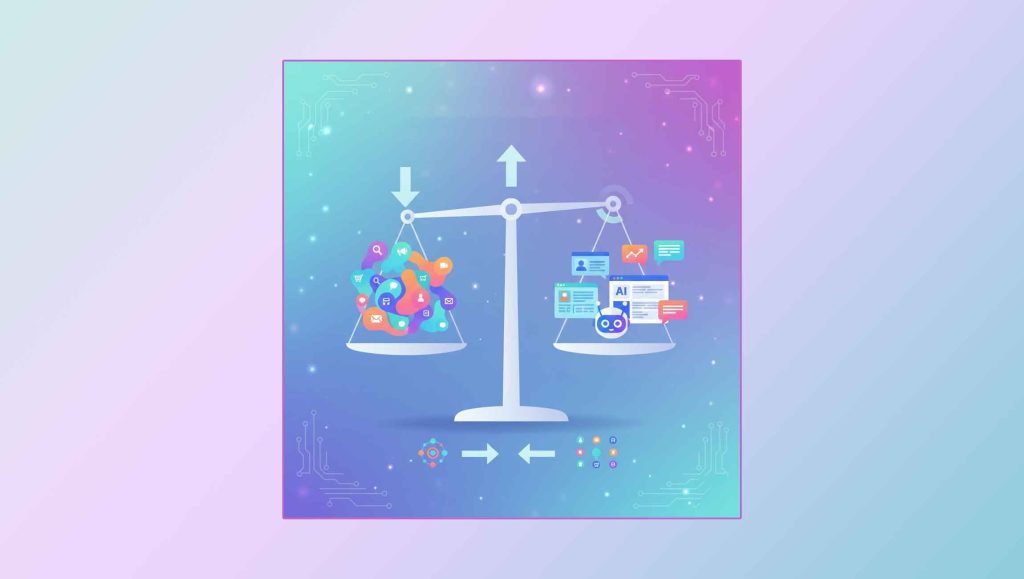
While it’s absolutely true that Infographics are visual in nature, the format itself is actually every bit as much a science as it is an art, so to speak. That is to say, you’re not simply replacing text-based information with relevant visuals. You need to strike a delicate balance between graphics and relevant, high-value information and you need to do so as often as possible.
Think about it like this. These days, nobody wants to scroll through their social media feed and see a massive wall of text – that’s a great way to have their eyes glaze over almost immediately. But at the same time, nobody wants to see a collection of seemingly unrelated visuals that don’t appear to make any form of sense together. That will ring hollow, too – and completely waste the potential that the Infographic format is known for.
As you conduct your research to figure out exactly what “story” your Infographic is going to tell, separate everything into two categories – that which can be expressed exclusively visually and that which will need a bit of a text-based explanation. It’s okay if you wind up with more text than you thought you would, provided that it is absolutely necessary to unravel the “narrative” behind your Infographic in the most compelling way possible.
One column should not be overwhelmingly larger than the other. For the best results, they should be about equal – thus allowing you to find the perfect balance between visuals and text, ending in an Infographic that your followers will enjoy.
Finally, a word of warning. If you’re going to be also hosting your Infographic on a site like your blog, make sure you use the right type of compression to get the file size as small as possible without sacrificing quality. Most people will leave a website immediately if it loads too slowly, regardless of whether or not it has the content they were looking for. The JPG format is usually best and, as a bonus, it will make it easy to share that Infographic on sites like Facebook and Twitter, too.


