The most recent stats show that, in the first quarter of 2020, over 8 million active advertisers were using Facebook to promote their products and services, while on Instagram, there are 2 million advertisers.
That being said, plenty of businesses are trying to get their brand in front of their audience and stand out against the competition.
Does that mean you have to increase your Facebook and Instagram advertising budget? Not necessarily.
A few months ago, at Bannersnack, we ran a few ad campaigns on a low budget, and the positive outcome—translated into 350% ROI—proves that you can achieve good results with an ad spend of $2,500.
Read More: SalesTechStar Interview With Brian Westnedge, Sr. Director, Global Channels At Valimail
Here’s what we learned from running these ad campaigns on Facebook and Instagram.
-
Campaign budget optimization (CBO) is a must
When you’re on a budget, inefficient spending is your worst enemy. That’s why you want to make sure you’re using campaign budget optimization to make the most of your ad spend, and you’re not ruining any chances of achieving the best results. Since we had different campaigns running for each placement (Facebook desktop, Facebook mobile, and Instagram) and two different ad groups, we were able to benefit from the advantages of using CBO.
-
The ad copy needs to emphasize the user’s benefit
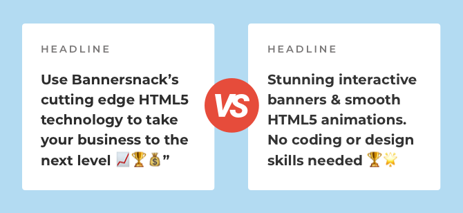
This is probably a no-brainer, but sometimes it’s good to remind yourself of what’s important when writing ad copy. Without a doubt, the ads that performed best were the ones where we explained the benefit of our tool and not the features we’re offering. After all, people are not interested in buying features. They want to know what they’re getting if they decide to purchase your services or products, which is the benefit.

Try to start the ad copy by highlighting the user’s benefit because this is going to get your audience hooked right away. Another thing we noticed is the fact that when we emphasized the benefit on the ad visual, our conversion rate increased so you can consider this option as well.
However, you need to pay attention not to use too much text on the image because it can get your ad rejected or limit its reach.
-
Create visual brand consistency
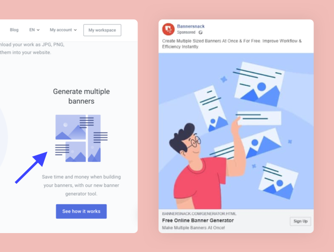
What I mean by this is the fact that the illustration or the image you use in the ad needs to be consistent with the visuals from the landing page your audience will click on. That way, you’ll create a connection between the ad’s creative and the landing page you decide to use for your ad.

Here are a few tips on how to create that much needed visual brand consistency:
->Use the same color scheme in the ad as well as on the landing page. You can achieve this by simply using the same colors on the landing page like the ones in the visual.
->Replicate the same elements you have on the landing page by integrating them in the ad. It can be anything from your brand’s signature to an icon or an illustration.
->In case you add a few words on the ad’s creative (not too many, though, so you don’t get your ad rejected), make sure to use the same font from your website.
-
Use different strategies for desktop and mobile
If you were to use the same ad for the Facebook desktop placement and Facebook mobile placement, you’d get very different results. That’s because the users’ behavior can vary quite a lot, depending on the device they’re using when they see your ad. To increase your chances of achieving satisfying results, it’s best to use a couple of different variations when it comes to ad copy and visual sizes.
We compared the Facebook desktop and mobile ad campaigns, analyzed the results, and concluded that you couldn’t expect to use the ad for two different placements and achieve the same results.
Don’t be afraid to create a couple of options and use them, especially if you’re advertising on Facebook and Instagram.
Read More: How Do You Drive Better Personalization In Every Sales And Marketing Outreach?
-
Avoid adding too many details on the image
This is especially important when we’re talking about using Facebook mobile as placement. Since mobile screens are much smaller than desktops, it’s not advisable to include too many details in the creative. You don’t want your audience to struggle to figure out what you’re trying to show or explain through the image. Instead, you want them to tell what you’re trying to convey or show immediately.
By keeping it simple, you will also help your audience focus on the big picture and not get distracted by unnecessary elements.
-
Stay up to date
This is definitely something that can influence the success of your advertising campaigns, and I’m going to give you a solid example.
For the ad campaigns we ran, we used a few different landscape ads alongside the square ones. Long story short, in some cases, the landscape ads brought out the best ROI because, back then, the landscape format was still popular and successfully used in Facebook advertising.
Now, on the other hand, trends clearly show that the square format brings the best results, which is why Facebook itself recommends it as well.
These days, trends come and go. Sometimes, they don’t even last for six months, which is why it’s essential to stay informed when it comes to best practices and create ad campaigns that bring you a positive ROI.
Listen In-> To the Latest Episodes of The SalesStar Podcast!
Conclusion
As a final note, I would like to say that low budget Facebook and Instagram ad campaigns do work and that you shouldn’t hesitate to embark on this online advertising journey.
Yes, there is a lot of competition, but, in the end, what influences your success lies in how you design and execute your campaigns.
Put your brand out there, regardless of the size of your budget, and try to learn something new at the end of every ad campaign.


